Clingy Fibers by Lusta
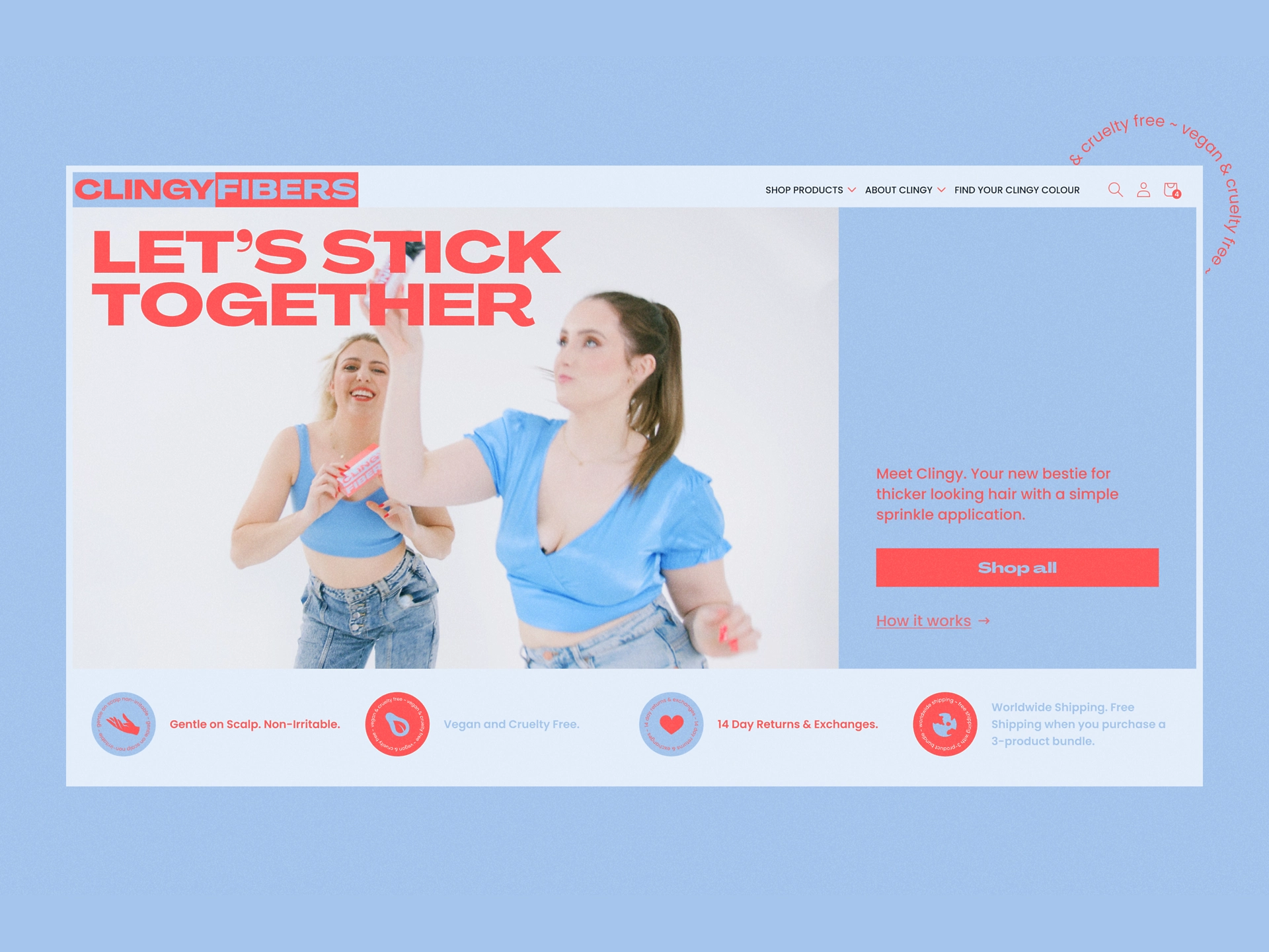
Let’s stick together
Packaging
Graphic Design
Branding
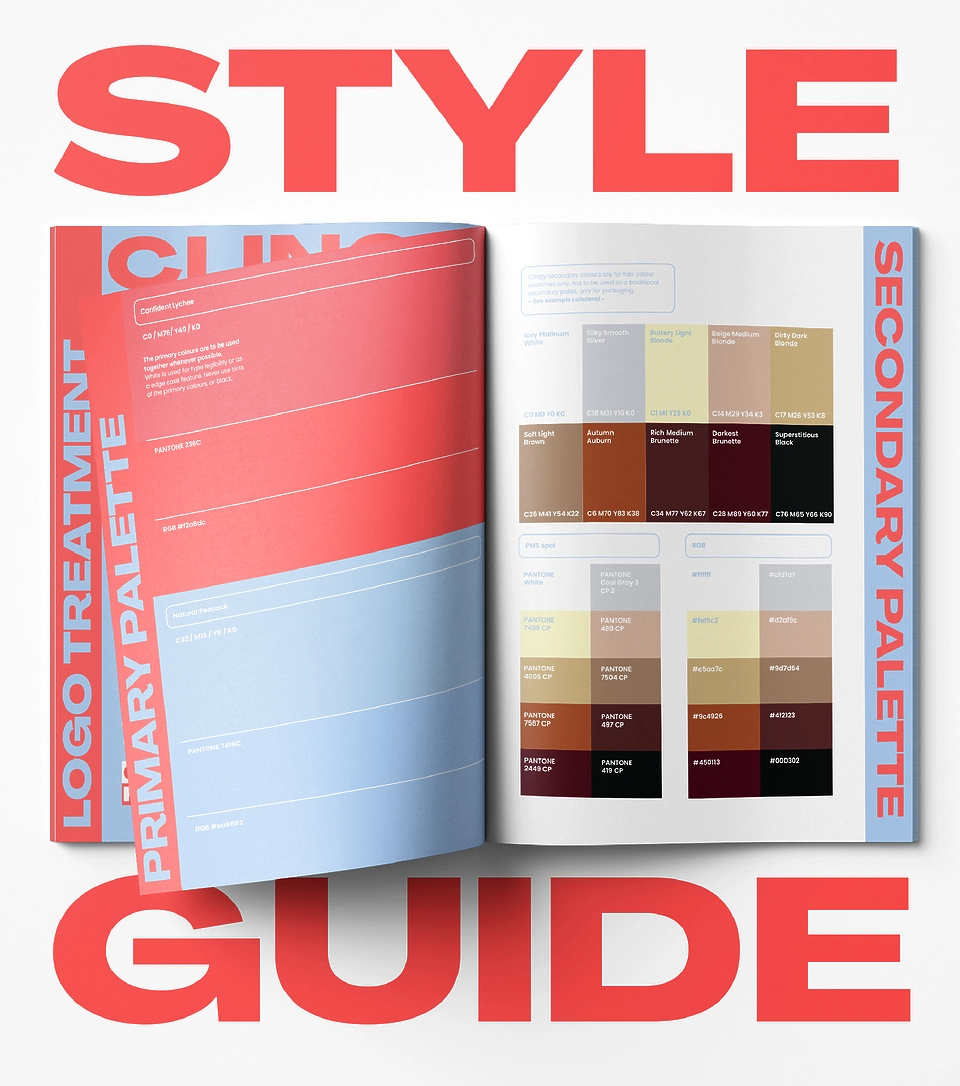
Style guidelines
Web development
Interface design
Experience design
E-commerce
Turn it up
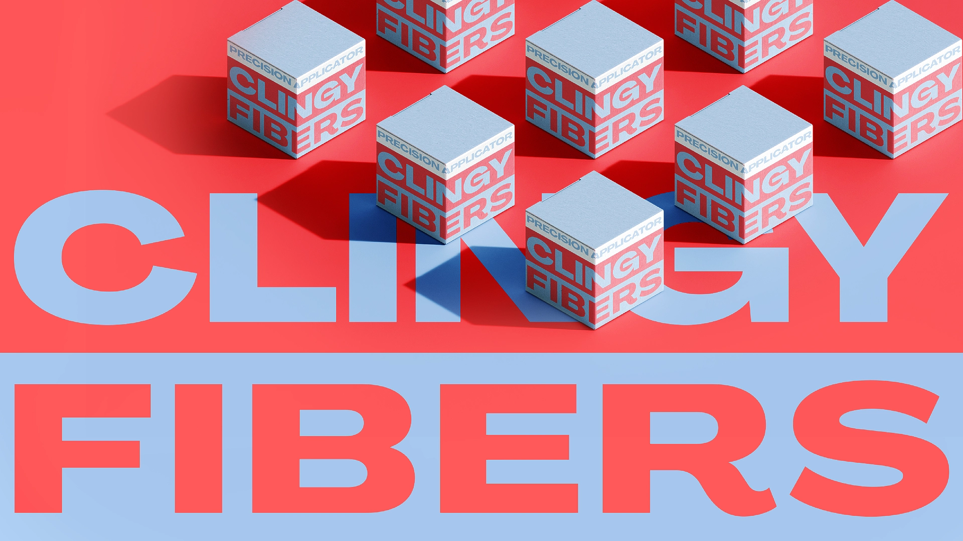
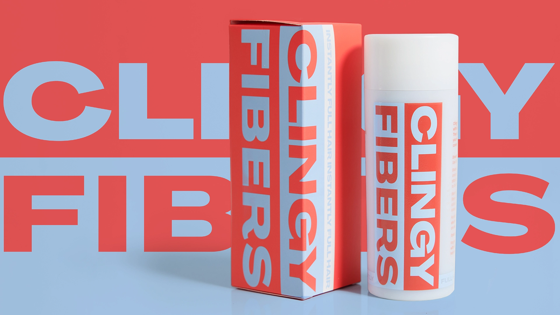
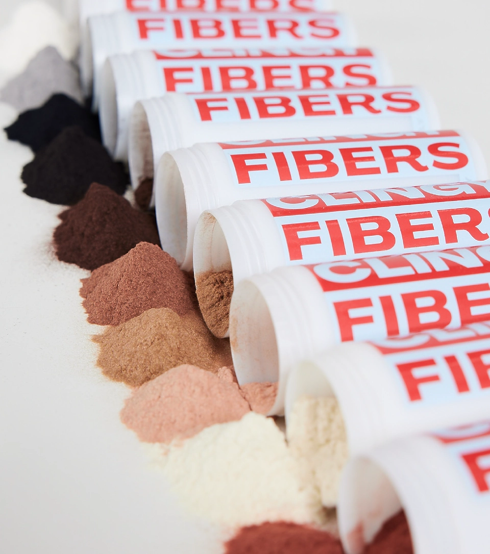
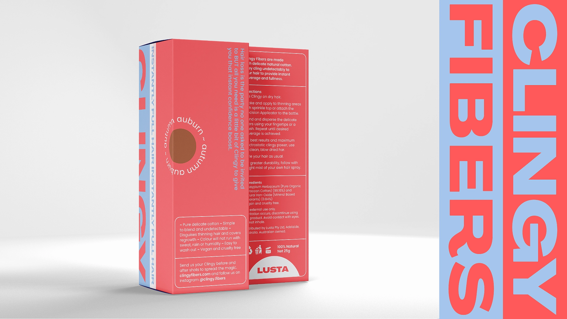
This certainly is a brand that wants to turn up the volume! (the volume of your hair, that is) The freshly squeezed identity recklessly shouts from the rooftops about the life changing product of Clingy Fibers. Self-confidence is for everyone! so Clingy needed an all inclusive style that fought back against traditional medical hair thinning aesthetics, embracing a strong defiant stance.
Being positive and being in charge
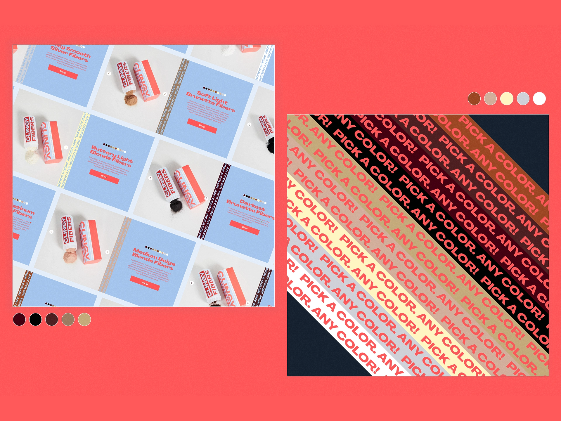
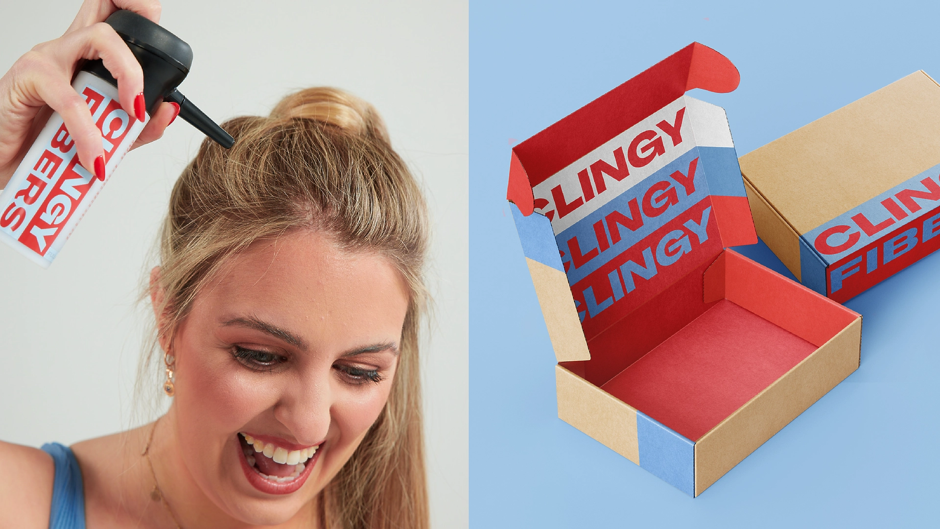
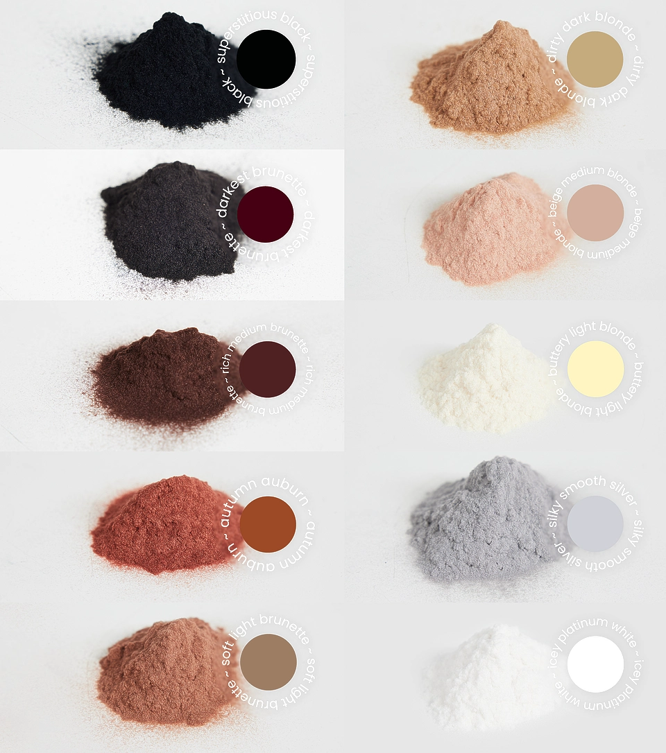
Clingy’s magic is uncomplicated, just cotton fibres and a heap of positivity. The instant results are amazing, worth shouting about! You absolutely oughta feel confident everyday. The vivid colour palette and demanding typography embody how ecstatic you’ll be for FINALLY finding a product that does the trick. And did you know it’s all down to the simple science of a positive electrical charge? Who says it isn’t worth being a little bit more positive everyday.
A site to behold
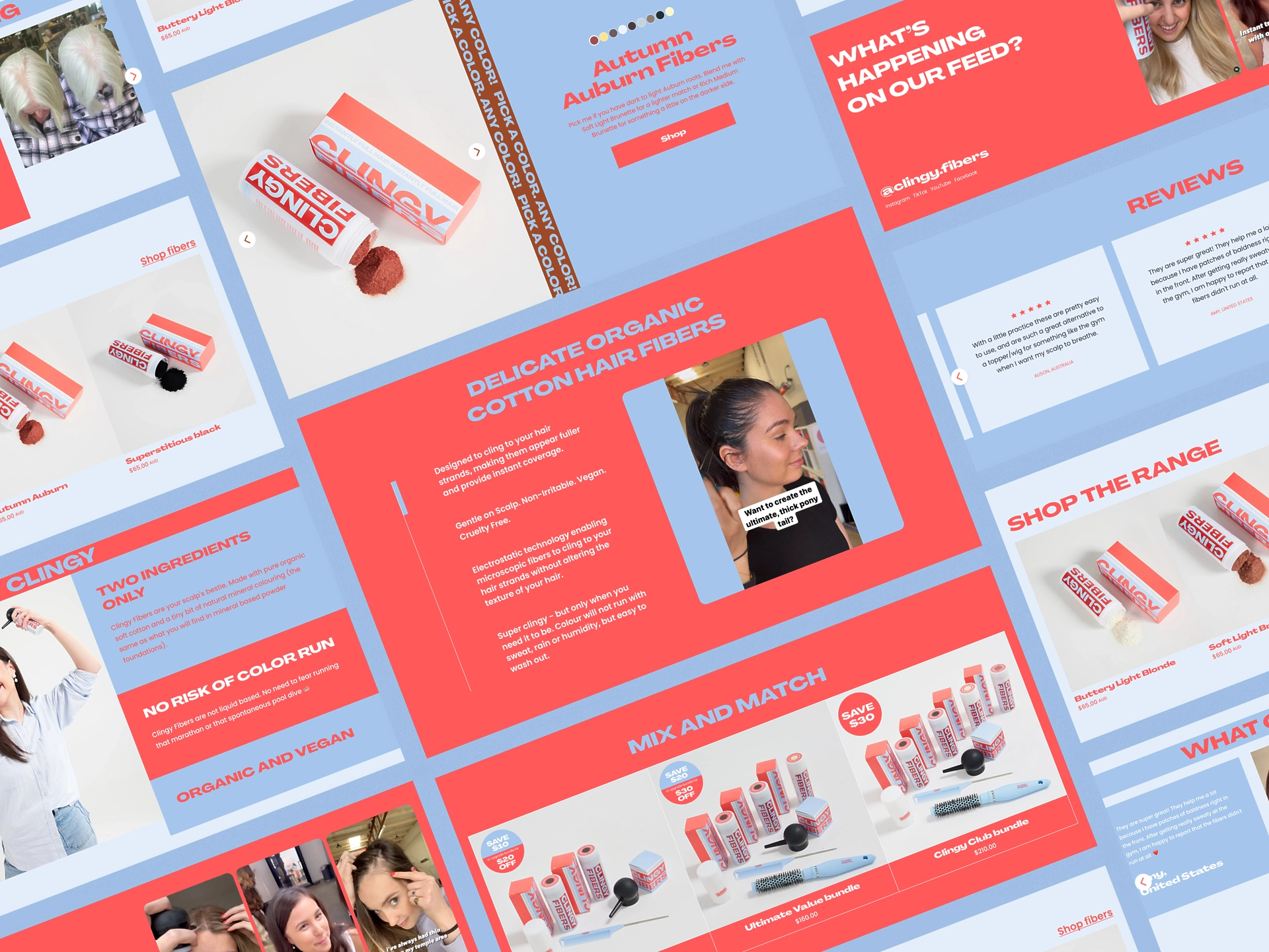
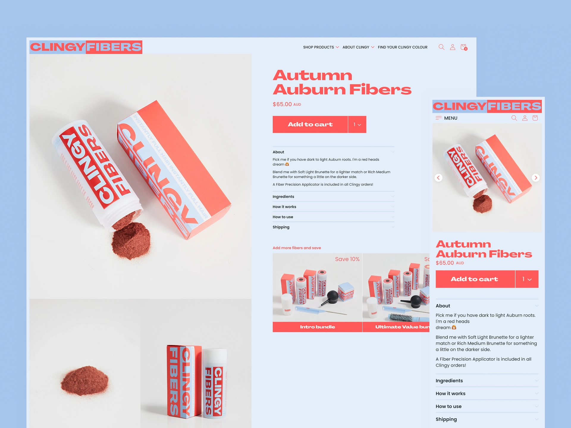
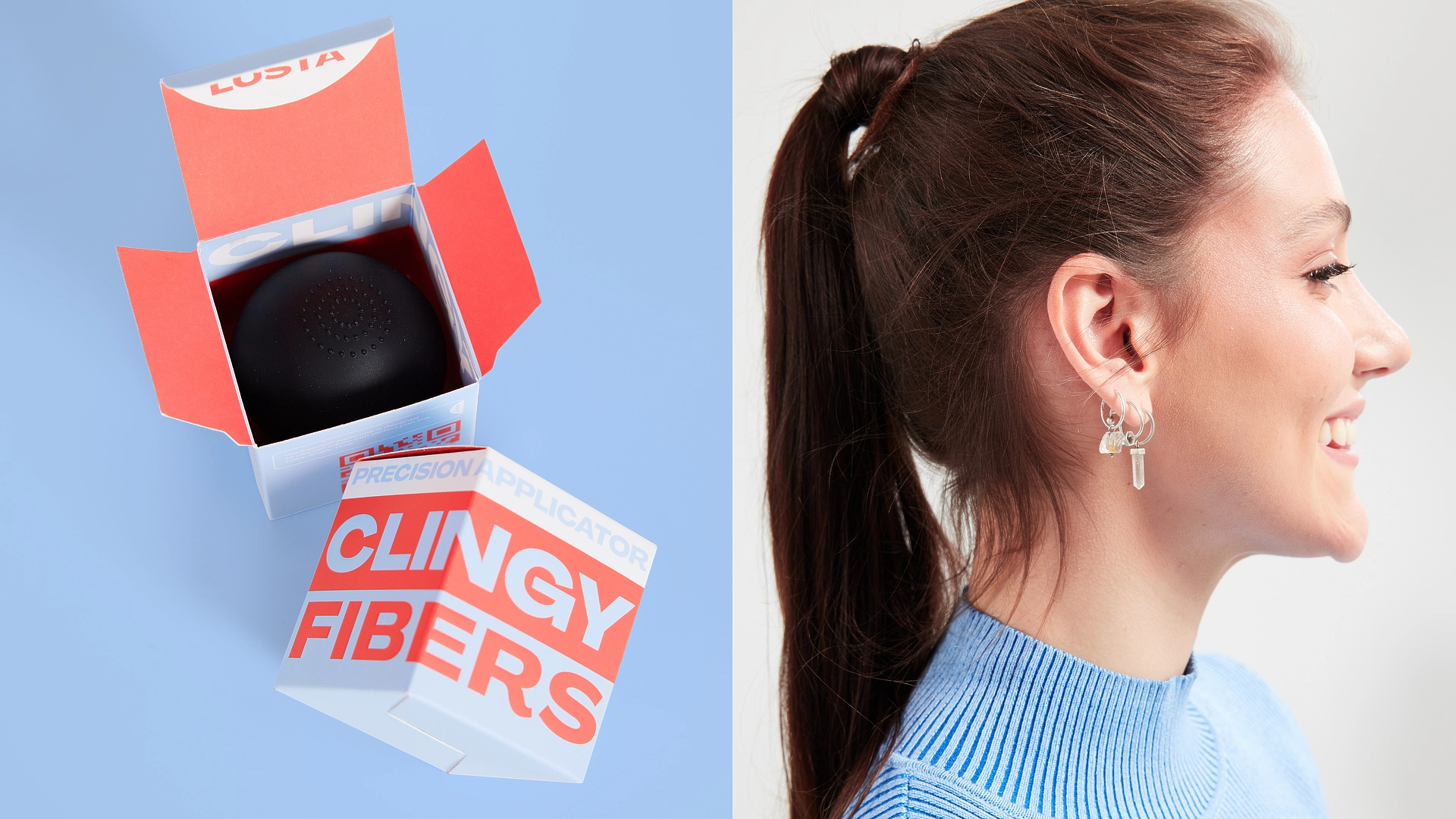
Clingy is backed by science, but she’s not here to be clinical. So, The Clingy website takes the brand values and sprints with ‘em! Being beautiful and smart. A niche product that blends explanation sales and community. The site puts a focus on video content and heartfelt testimonials, and features a smooth e-commerce experience. The strong duotone palette comes through loud and clear, perfectly framing the wonderfully playful videos and bespoke photoshoot pics.
